
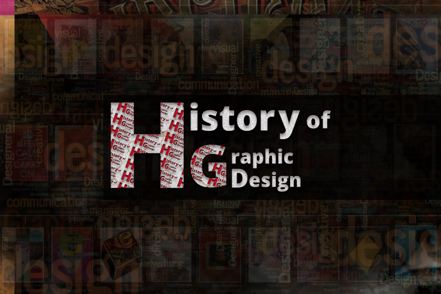
History of graphic design
Graphic design is so much a part of our modern world that it is hard to imagine living without it. And in some ways, we never have: visual communication is about as old as our opposable thumbs, though it’s been a long journey from stone tools to digital tablets. In short, the history of graphic design is a story that spans the entirety of human existence and it has the power to inspire and inform even modern graphic designers.
For one thing, knowing where, why and how this industry came about helps designers understand their place alongside history. In more practical terms, stylistic trends are cyclical, and studying the past can inspire some innovative ideas in the present.
- 15000 BC – 2000 BC
- THE INVENTION OF WRITING
It is not known precisely when or where Homo sapiens, the biological species of conscious, thinking creatures, emerged. As the search for our prehistoric origins continues, the early innovations of our ancestors have been pushed back further in time. It is believed that we evolved from a species that lived in the southern part of Africa. These early hominids ventured out onto the grassy plains and into caves as the forests in that part of the world slowly disappeared. In the tall grass, the hominids began to stand erect. Perhaps this adaptation was a result of the need to watch for predators, to help discourage enemies by increasing the hominids’ apparent size, or to hold branches as weapons. In any event, the hand developed an ability to carry food and hold objects. Found near Lake Turkana in Kenya, a nearly three-million-year-old stone that had been sharpened into an implement proves the thoughtful and deliberate development of a technology—a tool. Early shaped stones may have been used to dig for roots or to cut away flesh from dead animals for food. While we can only speculate about the use of early tools, we know that they mark a major step in the human species’ immense journey from primitive origins toward a civilized state.
1–3. Fremont rock painting from San Raphael Swell, c. 2000–1000 BCE. The Fremont people lived in southern Utah.
1–4. Engraved drawing on a deer antler, c. 15,000 BCE. This prehistoric image is shown in a cast made by rolling the antler onto clay.
1–4. Engraved drawing on a deer antler, c. 15,000 BCE. This prehistoric image is shown in a cast made by rolling the antler onto clay.
1–5. Early Sumerian pictographic tablet, c. 3100 BCE. This archaic pictographic script contained the seeds for the development of writing. Information is structured into grid zones by horizontal and vertical division.
1–5. Early Sumerian pictographic tablet, c. 3100 BCE. This archaic pictographic script contained the seeds for the development of writing. Information is structured into grid zones by horizontal and vertical division.
1–6. Archaic tablet fragment from the late fourth millennium BCE. The drilled hole denotes a number, and the pictographs represent animals in this transaction of sheep and goats
1–6. Archaic tablet fragment from the late fourth millennium BCE. The drilled hole denotes a number, and the pictographs represent animals in this transaction of sheep and goats.
- 2000 BC – 1000 BC
- ALPHABETS
Chapter 2
“Early visual language systems, including cuneiform, hieroglyphics, and written Chinese (see chapter 3), contained a built-in complexity. In each, pictographs had become rebus writing, ideographs, logograms, or even a syllabary. But these early writing systems remained unwieldy and required long, hard study to master. For centuries, the number of individuals who gained literacy was small. Their access to knowledge enabled them to acquire great power in the early cultures. The subsequent invention of the alphabet (a word derived from the first two letters of the Greek alphabet, alpha and beta) was a major step forward in human communications.”
2–24. Korean woodblock book translation, c. eighteenth century, of The Interpretation of Mencius’s Theory by Liu Chunji (1607–1675). Reading from right to left and top to bottom, single Chinese symbols are followed by Korean alphabetic translations.
2–1. This diagram displays several evolutionary steps of Western alphabets. The controversial theory linking early Cretan pictographs to alphabets is based on similarities in their appearance.
2–1. This diagram displays several evolutionary steps of Western alphabets. The controversial theory linking early Cretan pictographs to alphabets is based on similarities in their appearance.
2–6. Kufic characters are bold, elongated, and angular; their aesthetic properties are widely admired.
2–6. Kufic characters are bold, elongated, and angular; their aesthetic properties are widely admired.
2–20. Wall writing from Pompeii, first century CE. Over sixteen hundred messages ranging from passages from Vergil to crude obscenities were preserved under more than 3.6 meters (12 feet) of volcanic ash.
2–20. Wall writing from Pompeii, first century CE. Over sixteen hundred messages ranging from passages from Vergil to crude obscenities were preserved under more than 3.6 meters (12 feet) of volcanic ash.
2–4. The gestural curves of the Aramaic alphabet evolved into the Hebrew and Arabic alphabets.
2–4. The gestural curves of the Aramaic alphabet evolved into the Hebrew and Arabic alphabets.
3–11. Zhao Meng-fu, a goat and sheep, fourteenth century CE. Chops were used to imprint the names of owners or viewers of a painting.
3–11. Zhao Meng-fu, a goat and sheep, fourteenth century CE. Chops were used to imprint the names of owners or viewers of a painting.
3–7. Li Fangying (1696–1755), from Album of Eight Leaves, ink on paper, Qing dynasty, 1744. The design of the total page, with the bamboo bending out into the open space in contrast to the erect column of writing, ranks among the most outstanding examples
3–7. Li Fangying (1696–1755), from Album of Eight Leaves, ink on paper, Qing dynasty, 1744. The design of the total page, with the bamboo bending out into the open space in contrast to the erect column of writing, ranks among the most outstanding examples
3–6. Li (three-legged pottery vessel), late Neolithic period. The evolution of the calligraphic character Li stemmed from this pot: oracle bone pictograph; bronze script, 1000 BCE; and regular style, 200 BCE.
3–6. Li (three-legged pottery vessel), late Neolithic period. The evolution of the calligraphic character Li stemmed from this pot: oracle bone pictograph; bronze script, 1000 BCE; and regular style, 200 BCE.
2–1. This diagram displays several evolutionary steps of Western alphabets. The controversial theory linking early Cretan pictographs to alphabets is based on similarities in their appearance.
2–1. This diagram displays several evolutionary steps of Western alphabets. The controversial theory linking early Cretan pictographs to alphabets is based on similarities in their appearance.
2–6. Kufic characters are bold, elongated, and angular; their aesthetic properties are widely admired.
2–6. Kufic characters are bold, elongated, and angular; their aesthetic properties are widely admired.
2–20. Wall writing from Pompeii, first century CE. Over sixteen hundred messages ranging from passages from Vergil to crude obscenities were preserved under more than 3.6 meters (12 feet) of volcanic ash.
2–20. Wall writing from Pompeii, first century CE. Over sixteen hundred messages ranging from passages from Vergil to crude obscenities were preserved under more than 3.6 meters (12 feet) of volcanic ash.
2–4. The gestural curves of the Aramaic alphabet evolved into the Hebrew and Arabic alphabets.
2–4. The gestural curves of the Aramaic alphabet evolved into the Hebrew and Arabic alphabets.
1–4. Engraved drawing on a deer antler, c. 15,000 BCE. This prehistoric image is shown in a cast made by rolling the antler onto clay.
1–4. Engraved drawing on a deer antler, c. 15,000 BCE. This prehistoric image is shown in a cast made by rolling the antler onto clay.
1–5. Early Sumerian pictographic tablet, c. 3100 BCE. This archaic pictographic script contained the seeds for the development of writing. Information is structured into grid zones by horizontal and vertical division.
1–5. Early Sumerian pictographic tablet, c. 3100 BCE. This archaic pictographic script contained the seeds for the development of writing. Information is structured into grid zones by horizontal and vertical division.
1–6. Archaic tablet fragment from the late fourth millennium BCE. The drilled hole denotes a number, and the pictographs represent animals in this transaction of sheep and goats
1–6. Archaic tablet fragment from the late fourth millennium BCE. The drilled hole denotes a number, and the pictographs represent animals in this transaction of sheep and goats
- 1000 BC
- THE ASIAN CONTRIBUTION
Chapter 3
Chinese changed the course of human events. The compass made exploration and seafaring possible. Gunpowder, used by the Chinese for fireworks, fueled an aggressive aspect of the human temperament and changed the nature of war. Chinese calligraphy, an ancient writing system, is used today by more people than any other visual language system. Paper, a magnificent and economical substrate for transmitting information, and printing, the duplication of words and images, made possible the wide communication of thought and deed. Europeans adopted these Chinese inventions and used them to conquer much of the world: the compass (which may have been developed independently in Europe) directed early explorers across the seas and around the globe; firearms enabled Europeans to subjugate the native populations of Africa, Asia, and the Americas; and printing on paper became the method for spreading European language, culture, religion, and law throughout the world.
3–8. Shi Tao, the Love of Lotus landscape, Qing dynasty. Simple and refined, the painting displays both personal expression and reality.
3–11. Zhao Meng-fu, a goat and sheep, fourteenth century CE. Chops were used to imprint the names of owners or viewers of a painting.
3–11. Zhao Meng-fu, a goat and sheep, fourteenth century CE. Chops were used to imprint the names of owners or viewers of a painting.
3–7. Li Fangying (1696–1755), from Album of Eight Leaves, ink on paper, Qing dynasty, 1744. The design of the total page, with the bamboo bending out into the open space in contrast to the erect column of writing, ranks among the most outstanding examples
3–7. Li Fangying (1696–1755), from Album of Eight Leaves, ink on paper, Qing dynasty, 1744. The design of the total page, with the bamboo bending out into the open space in contrast to the erect column of writing, ranks among the most outstanding examples
3–6. Li (three-legged pottery vessel), late Neolithic period. The evolution of the calligraphic character Li stemmed from this pot: oracle bone pictograph; bronze script, 1000 BCE; and regular style, 200 BCE.
3–6. Li (three-legged pottery vessel), late Neolithic period. The evolution of the calligraphic character Li stemmed from this pot: oracle bone pictograph; bronze script, 1000 BCE; and regular style, 200 BCE.
- 1399 – 1799
- ILLUMINATED MANUSCRIPTS
Chapter 4
The vibrant luminosity of gold leaf, as “it reflected light from the pages of handwritten books, gave the sensation of the page being literally illuminated; thus, this dazzling effect gave birth to the term illuminated manuscript. Today this name is used for all decorated and illustrated handwritten books produced from the late Roman Empire until printed books replaced manuscripts after typography was developed in Europe around 1450.”
4–13. Moralia in Iob (Commentary on Job) by Pope Gregory the Great, Latin manuscript from France, eleventh or twelfth century. This is an example of the Caroline minuscule at its most refined and elegant.
4–12. Capitularies of Charlemagne and Louis the Pious, c. 873 CE, created in Rheims at a scriptorium associated with Charles the Bald (emperor 840–77). The capitularies is a compilation of law codes assembled by Ansegisus, abbot of Saint Wandrille, in 827
4–12. Capitularies of Charlemagne and Louis the Pious, c. 873 CE, created in Rheims at a scriptorium associated with Charles the Bald (emperor 840–77). The capitularies is a compilation of law codes assembled by Ansegisus, abbot of Saint Wandrille, in 827
4–4. The Book of Durrow, the man, symbol of Matthew, 680 CE. As flat as a cubist painting and constructed from simple geometric forms, this figure, facing the opening of the Gospel of Saint Matthew, wears a checkered pattern of red, yellow, and green squa
4–4. The Book of Durrow, the man, symbol of Matthew, 680 CE. As flat as a cubist painting and constructed from simple geometric forms, this figure, facing the opening of the Gospel of Saint Matthew, wears a checkered pattern of red, yellow, and green squa
4–5. The Book of Durrow, opening page, the Gospel of Saint Mark, 680 CE. Linked into a ligature, an I and an N become an aesthetic form of interlaced threads and coiling spiral motifs.
4–5. The Book of Durrow, opening page, the Gospel of Saint Mark, 680 CE. Linked into a ligature, an I and an N become an aesthetic form of interlaced threads and coiling spiral motifs.
3–11. Zhao Meng-fu, a goat and sheep, fourteenth century CE. Chops were used to imprint the names of owners or viewers of a painting.
3–11. Zhao Meng-fu, a goat and sheep, fourteenth century CE. Chops were used to imprint the names of owners or viewers of a painting.
3–7. Li Fangying (1696–1755), from Album of Eight Leaves, ink on paper, Qing dynasty, 1744. The design of the total page, with the bamboo bending out into the open space in contrast to the erect column of writing, ranks among the most outstanding examples
3–7. Li Fangying (1696–1755), from Album of Eight Leaves, ink on paper, Qing dynasty, 1744. The design of the total page, with the bamboo bending out into the open space in contrast to the erect column of writing, ranks among the most outstanding examples
3–6. Li (three-legged pottery vessel), late Neolithic period. The evolution of the calligraphic character Li stemmed from this pot: oracle bone pictograph; bronze script, 1000 BCE; and regular style, 200 BCE.
3–6. Li (three-legged pottery vessel), late Neolithic period. The evolution of the calligraphic character Li stemmed from this pot: oracle bone pictograph; bronze script, 1000 BCE; and regular style, 200 BCE.
- 1400
- PRINTING COMES TO EUROPE
Chapter 5
“Xylography is the technical term for the relief printing from a raised surface that originated in Asia. Typography is the term for printing with independent, movable, and reusable bits of metal or wood, each of which has a raised letterform on one face. This dry definition belies the immense potential for human dialogue and the new horizons for graphic design that were unleashed by this extraordinary invention in the mid-1400s ”
5–5. Block-book page from The Story of the Blessed Virgin, 1400s. This page attempts to justify the Immaculate Conception by a series of “logical” parallels: If the light of Venus’s temple cannot be extinguished, if the moon is reflected in water, if a pe
5–1. French watermark designs, fifteenth century. These mermaid designs were produced by bent wire attached to the mold used in making paper.
5–1. French watermark designs, fifteenth century. These mermaid designs were produced by bent wire attached to the mold used in making paper.
5–2. Jack of Diamonds, woodblock playing card, c. 1400. The flat, stylized design conventions of playing cards have changed little in over five hundred years. Visual signs to designate the suits began as the four classes of medieval society. Hearts signif
5–2. Jack of Diamonds, woodblock playing card, c. 1400. The flat, stylized design conventions of playing cards have changed little in over five hundred years. Visual signs to designate the suits began as the four classes of medieval society. Hearts signif
5–15. Johann Gutenberg, page 266 from the Gutenberg Bible, 1450–55.
5–15. Johann Gutenberg, page 266 from the Gutenberg Bible, 1450–55.
- 1400 – 1600
- RENAISSANCE GRAPHIC DESIGN
Chapter 6
“The word renaissance means “revival” or “rebirth.” Originally this term was used to denote the period that began in the fourteenth and fifteenth centuries in Italy, when the classical literature of ancient Greece and Rome was revived and read anew. However, the word is now generally used to encompass the period marking the transition from the medieval to the modern world. In the history of graphic design, the renaissance of classical literature and the work of the Italian humanists are closely bound to an innovative approach to book design. Type design, page layout, ornaments, illustration—even the total design of the book—were all rethought by Italian printers and scholars.”
7–34. Geoffroy Tory, pages from Horae in Laudem Beautissim ce Virginis Mariae (Hours of Our Excellent Virgin Mary), 1541. A set of border components, filled with plant and animal motifs, are combined and recombined throughout the book. The open line quali
7–37. Geoffroy Tory, fantastic alphabet from Champ Fleury, 1529. The thirteen alphabets concluding this book (Hebrew, Greek, Persian, and so on) included this whimsical sequence of pictorial letterforms composed of tools. A is a compass, B is a fusy (stee
7–37. Geoffroy Tory, fantastic alphabet from Champ Fleury, 1529. The thirteen alphabets concluding this book (Hebrew, Greek, Persian, and so on) included this whimsical sequence of pictorial letterforms composed of tools. A is a compass, B is a fusy (stee
7–11. Erhard Ratdolt, Peter Loeslein, and Bernhard Maler, pages from Calendarium, by Regiomontanus, 1476. An additional three-part mathematical wheel charts for calculating the solar cycles.
7–11. Erhard Ratdolt, Peter Loeslein, and Bernhard Maler, pages from Calendarium, by Regiomontanus, 1476. An additional three-part mathematical wheel charts for calculating the solar cycles.
7–5. Printer’s trademark, 1481. Attributed to Andreas Torresanus (1451–1529). One of the oldest symbolic themes, the orb and cross is found in a chamber of Cheops’s pyramid at Giza, where it was hewn into stone as a quarry mark. A fairly common design de
7–5. Printer’s trademark, 1481. Attributed to Andreas Torresanus (1451–1529). One of the oldest symbolic themes, the orb and cross is found in a chamber of Cheops’s pyramid at Giza, where it was hewn into stone as a quarry mark. A fairly common design de
- 1500
- THE GERMAN ILLUSTRATED BOOK
Chapter 7
“The Latin word incunabula means “cradle” or “baby linen.” Its connotations of birth and beginnings led seventeenth-century writers to adopt it as a name for books printed between Gutenberg’s invention of typography in the 1450s and the end of the fifteenth century. (The traditional end-date is completely arbitrary; this chapter traces the logical continuation of trends in design and typography into the early 1500s.) Printing spread rapidly. By 1480 twenty-three northern European towns, thirty-one Italian towns, seven French towns, six Iberian towns, and one English town had presses. By 1500 printing was practiced in over 140 towns.”
6–19. Albrecht Dürer, broadside, 1515. Dürer developed his woodcut illustration from a sketch and description sent from Spain, after the first rhinoceros in over a thousand years arrived in Europe.
6–29. Conrad Sweynheym and Arnold Pannartz, page from Augustine of Hippo’s City of God, 1467. This is the first printed volume of St. Augustine’s City of God and one of four books printed by Sweynheym and Pannartz at the Benedictine monastery at Subiaco.
6–29. Conrad Sweynheym and Arnold Pannartz, page from Augustine of Hippo’s City of God, 1467. This is the first printed volume of St. Augustine’s City of God and one of four books printed by Sweynheym and Pannartz at the Benedictine monastery at Subiaco.
6–27. Portrait of Martin Luther, 1521.
6–27. Portrait of Martin Luther, 1521.
6–25. Hans Lufft (printer) and Lucas Cranach the Younger (illustrator), pages from Fabian von Auerswald’s Ringer-Kunst (Art of Wrestling), 1539. Lufft printed Cranach’s eighty-seven woodcuts without the usual border, enabling them to move dynamically on t
6–25. Hans Lufft (printer) and Lucas Cranach the Younger (illustrator), pages from Fabian von Auerswald’s Ringer-Kunst (Art of Wrestling), 1539. Lufft printed Cranach’s eighty-seven woodcuts without the usual border, enabling them to move dynamically on t
- 1600 – 1700
- AN EPOCH OF TYPOGRAPHIC GENIUS
Chapter 8
“After a drought of graphic-design creativity during the 1600s, the eighteenth century was an epoch of typographic originality. In 1692 the French king Louis XIV, who had a strong interest in printing, ordered a committee of scholars to develop a new typeface for the Imprimerie Royale, the royal printing office established in 1640 to restore quality. The new letters were to be designed by “scientific” principles. Headed by mathematician Nicolas Jaugeon, the academicians examined all previous alphabets and studies on type design”.
8–2. Louis Simonneau, construction of the letters G and H for the Romain du Roi, c. 1700.
8–30. William Blake, title page from America, a Prophecy, 1793.
8–30. William Blake, title page from America, a Prophecy, 1793.
8–22. The 1771 type specimen title page from Fregi e Majuscole The tremendous influence of Fournier le Jeune upon Bodoni’s earlier work is evident in this page design. 8–30. William Blake, title page from America, a Prophecy, 1793.
8–22. The 1771 type specimen title page from Fregi e Majuscole The tremendous influence of Fournier le Jeune upon Bodoni’s earlier work is evident in this page design. 8–30. William Blake, title page from America, a Prophecy, 1793.
8–10. John Pine, page from Horace’s Opera (Works), Volume II, 1737. Illustration and text were hand-engraved upon a copper printing plate and printed in one pass through the press.
8–10. John Pine, page from Horace’s Opera (Works), Volume II, 1737. Illustration and text were hand-engraved upon a copper printing plate and printed in one pass through the press.
- 1700 – 1850
- GRAPHIC DESIGN AND THE INDUSTRIAL REVOLUTION
Chapter 9
The Industrial Revolution, which is usually said to have occurred first in England between 1760 and 1840, was a radical process of social and economic change. Energy was a major impetus for the conversion from an agricultural society to an industrial one. Until James Watt (1736–1819) perfected the steam engine, which was deployed rapidly starting in the 1780s, animal and human power were the primary sources of energy. Over the course of the nineteenth century, the amount of energy generated by steam power increased a hundredfold. During the last three decades of the century, electricity and gasoline-fueled engines further expanded productivity. A factory system with machine manufacturing and divisions of labor was developed. New materials, particularly iron and steel, became available.
9–22. The first steam-powered cylinder press, 1814. Koenig’s invention caused the speed of printing to skyrocket, while its price dropped considerably.
9–21. This engraved illustration depicts the printing press of all-iron parts invented in England by Charles Stanhope.
9–21. This engraved illustration depicts the printing press of all-iron parts invented in England by Charles Stanhope.
9–19. Handbill for an excursion train, 1876. To be bolder than bold, the compositor used heavier letterforms for the initial letter of important words. Oversized terminal letterforms combine with condensed and extended styles in the phrase Maryland Day!
9–19. Handbill for an excursion train, 1876. To be bolder than bold, the compositor used heavier letterforms for the initial letter of important words. Oversized terminal letterforms combine with condensed and extended styles in the phrase Maryland Day!
9–16. Rand and Avery foundry, ornamental fonts, Boston, 1867.
9–16. Rand and Avery foundry, ornamental fonts, Boston, 1867.
9–12. Johann Heinrich Meyer foundry in Braunschweig, Germany, decorative three-dimensional fonts, 1835.
9–12. Johann Heinrich Meyer foundry in Braunschweig, Germany, decorative three-dimensional fonts, 1835.
- 1800 – 1950
- THE ARTS AND CRAFTS MOVEMENT AND ITS HERITAGE
Chapter 10
Late in the century, when a book-design renaissance began. This revival—which first treated the book as a limited-edition art object and then influenced commercial production—was largely a result of the Arts and Crafts movement, which flourished in England during the last decades of the nineteenth century as a reaction against the social, moral, and artistic confusion of the Industrial Revolution. Design and a return to handicraft were advocated.“cheap and nasty” mass-produced goods of the Victorian era were abhorred. The leader of the English Arts and Crafts movement, William Morris (1834–96), called for a fitness of purpose, truth to the nature of materials and methods of production, and individual expression by both designer and worker.
10–29. The Craftsman covers, February 1914 and June 1915. Though not illustrated by Gustav Stickley, these designs show an interest in the Japanese woodblock aesthetic.
10–47. Morris F. Benton, typeface designs: Alternate Gothic, 1906; Century Schoolbook, 1920; Clearface, 1907; Cloister Bold, 1913; Franklin Gothic, 1905; News Gothic, 1908; Souvenir, 1914; Stymie Medium, 1931.
10–47. Morris F. Benton, typeface designs: Alternate Gothic, 1906; Century Schoolbook, 1920; Clearface, 1907; Cloister Bold, 1913; Franklin Gothic, 1905; News Gothic, 1908; Souvenir, 1914; Stymie Medium, 1931.
10–17. William Morris (designer) and Walter Crane (illustrator), page spread for The Story of the Glittering Plain, 1894. Operating on his compulsion to ornament the total space, Morris created a luminous range of contrasting values.
10–17. William Morris (designer) and Walter Crane (illustrator), page spread for The Story of the Glittering Plain, 1894. Operating on his compulsion to ornament the total space, Morris created a luminous range of contrasting values.
10–10. Selwyn Image, title page to the Century Guild Hobby Horse, 1884. Packing it with detail, Image designed a “page within a page” that reflects the medieval preoccupation of the Arts and Crafts movement.
10–10. Selwyn Image, title page to the Century Guild Hobby Horse, 1884. Packing it with detail, Image designed a “page within a page” that reflects the medieval preoccupation of the Arts and Crafts movement.
10–3. William Pickering, title page from The Elements of Euclid, 1847. A system of color coding brought clarity to the teaching of geometry.
10–3. William Pickering, title page from The Elements of Euclid, 1847. A system of color coding brought clarity to the teaching of geometry.
- 1880 – 1901
- ART NOUVEAU
Chapter 11
Increased trade and communication between Asian and European countries during the late nineteenth century caused a cultural collision; both East and West experienced change as a result of reciprocal influences. Asian art provided European and North American artists and designers with approaches to space, color, drawing conventions, and subject matter that were radically unlike Western traditions. This revitalized graphic design during the last decade of the nineteenth century.
11–8. Jules Chéret, poster for Orphée aux Enfers (Orpheus in Hades), 1879. Chéret evolved toward larger, more animated figures and greater unity of word and image.
11–36. Alphonse Mucha, poster for Job cigarette papers, 1898. Mucha delighted in filling the total space with animated form and ornament.
11–36. Alphonse Mucha, poster for Job cigarette papers, 1898. Mucha delighted in filling the total space with animated form and ornament.
11_34. Alphonse Mucha, Gismonda poster, 1894. The life-size figure, mosaic pattern, and elongated shape created an overnight sensation.
11_34. Alphonse Mucha, Gismonda poster, 1894. The life-size figure, mosaic pattern, and elongated shape created an overnight sensation.
11–33. Eugène Grasset, poster for Sarah Bernhardt as Joan of Arc, 1894. A medieval figure stands before sky patterns inspired by ukiyo-e prints.
11–33. Eugène Grasset, poster for Sarah Bernhardt as Joan of Arc, 1894. A medieval figure stands before sky patterns inspired by ukiyo-e prints.
11–12. Eugène Grasset, title page for Histoire des quatre fils Aymon (Tale of the Four Sons of Aymon), 1883. Dividing the space into zones, Grasset unified lettering, illustration, and decorative patterns into a total page design. Reynaud, Alard, Guichard
11–12. Eugène Grasset, title page for Histoire des quatre fils Aymon (Tale of the Four Sons of Aymon), 1883. Dividing the space into zones, Grasset unified lettering, illustration, and decorative patterns into a total page design. Reynaud, Alard, Guichard.
- 1896 – 1972
- THE GENESIS OF TWENTIETH-CENTURY DESIGN
Chapter 12
Enter story info hereThe turn of a century invites introspection. As one century closes and a new one begins, writers and artists begin to question conventional wisdom and speculate on new possibilities for changing the circumstances of culture. For example, the end of the eighteenth century gave birth to a new category of typeface design, which is still called the modern style two hundred years later. At the same time, the neoclassical revival of Greco-Roman forms in architecture, clothing, painting, and illustration replaced baroque and rococo design. As the nineteenth century drew to a close and the twentieth century began, designers across the disciplines of architectural, fashion, graphic, and product design searched for new forms of expression. Technological and industrial advances fed these concerns.
12–10. Koloman Moser, fifth Vienna Secession exhibition poster, 1899. A metallic gold bronze figure and olive green background are printed on yellow tone paper that forms the contour lines.
12–46. Peter Behrens, poster for a Deutsche Werkbund exhibition, 1914. The designer is an allegorical torchbearer, in keeping with the Werkbund view that design is an enlightening and humanizing social force. The subtitle reads, “Art in Craft, Industry, a
12–46. Peter Behrens, poster for a Deutsche Werkbund exhibition, 1914. The designer is an allegorical torchbearer, in keeping with the Werkbund view that design is an enlightening and humanizing social force. The subtitle reads, “Art in Craft, Industry, a
12–32. Berthold Foundry, Akzidenz Grotesk typefaces, 1898–1906. An elegant system of weight contrast is achieved in these pioneering letter-forms.
12–32. Berthold Foundry, Akzidenz Grotesk typefaces, 1898–1906. An elegant system of weight contrast is achieved in these pioneering letter-forms.
12–31. Peter Behrens, cover for Dokumente des Modernen Kunstgewerbes… (Documents of Modern Applied Arts…), 1901. The decorative geometric design and sans-serif lettering based on a square foreshadow art deco design of the 1920s and 1930s.
12–31. Peter Behrens, cover for Dokumente des Modernen Kunstgewerbes… (Documents of Modern Applied Arts…), 1901. The decorative geometric design and sans-serif lettering based on a square foreshadow art deco design of the 1920s and 1930s.
12–4. Charles Rennie Mackintosh, poster for the Scottish Musical Review, 1896. In this towering image that rises 2.5 meters (over 8 feet) above the spectator, complex overlapping planes are unified by areas of flat color. The white ring and birds around t
12–4. Charles Rennie Mackintosh, poster for the Scottish Musical Review, 1896. In this towering image that rises 2.5 meters (over 8 feet) above the spectator, complex overlapping planes are unified by areas of flat color. The white ring and birds around t
- 1900 – 1930
- THE INFLUENCE OF MODERN ART
Chapter 13
The first two decades of the twentieth century were a time of ferment and change that radically altered all aspects of the human condition. The social, political, cultural, and economic character of life was caught in fluid upheaval. In Europe, monarchy was replaced by democracy, socialism, and communism. Technology and scientific advances transformed commerce and industry. Transportation was radically altered by the coming of the motorcar (1885) and the airplane (1903). The motion picture (1896) and wireless radio transmission (1895) foretold a new era of human communications. Beginning in 1908, with the Turkish revolution that restored constitutional government and the Bulgarian declaration of independence, colonized and subjugated peoples began to awaken and demand independence. The slaughter during the first of two global wars, fought with the destructive weapons of technology, shook the traditions and institutions of Western civilization to their foundations.
13–29. Hannah Höch, Da—dandy, collage and photomontage, 1919. Images and materials are recycled, with both chance juxtapositions and planned decisions contributing to the creative process.
13–46. René Magritte, illustration for “Les Chants de Maldoror,” c. 1937. The surrealists defied our rational understanding of the world, and their vocabulary of pictorial and symbolic innovations began to seep into the mass media.
13–46. René Magritte, illustration for “Les Chants de Maldoror,” c. 1937. The surrealists defied our rational understanding of the world, and their vocabulary of pictorial and symbolic innovations began to seep into the mass media.
13–11. Filippo Marinetti, foldout from Les mots en liberté futuristes, 1919. Here, the confusion, violent noise, and chaos of battle explode above the girl reading her lover’s letter from the front. Marinetti’s experience in the trenches of war inspired t
13–11. Filippo Marinetti, foldout from Les mots en liberté futuristes, 1919. Here, the confusion, violent noise, and chaos of battle explode above the girl reading her lover’s letter from the front. Marinetti’s experience in the trenches of war inspired t
13–7. Fernand Léger, page from La fin du monde, 1919. A whirlwind tour of the re-creation of the earth after the fall of man is illustrated by a pinwheel of lettering spelling “accelerated slow motion cinema.”
13–7. Fernand Léger, page from La fin du monde, 1919. A whirlwind tour of the re-creation of the earth after the fall of man is illustrated by a pinwheel of lettering spelling “accelerated slow motion cinema.”
13–1. Pablo Picasso, Nude, c. 1906–7. The seeds of cubism are contained in the fragmentation of the figure and background spaces into abstracted geometric planes.
13–1. Pablo Picasso, Nude, c. 1906–7. The seeds of cubism are contained in the fragmentation of the figure and background spaces into abstracted geometric planes.
- 1900 – 1925
- PICTORIAL MODERNISM
Chapter 14
If the European poster of the first half of the twentieth century was in many ways a continuation of the 1890s poster, its course was nevertheless strongly affected in the second decade of the century by new modern-art movements and the communication needs of world war. Although influenced by cubism and constructivism, poster designers were cognizant of the need to maintain a pictorial reference if their posters were to communicate persuasively with the general public; they walked a tightrope between the desire for expressive and symbolic images on the one hand and concern for the total visual organization of the picture plane on the other. This dialogue between communicative imagery and design form generates the excitement and energy of pictorial graphics influenced by modern art.
14–31. James Montgomery Flagg, poster for military recruiting, 1917. Five million copies of Flagg’s poster were printed, making it one of the most widely reproduced posters in history.
14–47. E. McKnight Kauffer, poster for the London Underground, 1924. The essence of the subject is distilled into dynamic colored planes
14–47. E. McKnight Kauffer, poster for the London Underground, 1924. The essence of the subject is distilled into dynamic colored planes
14–20. Niklaus Stoecklin, Bi-Oro poster, 1941. Beneath a pair of sunglasses, the tube of sunscreen lotion becomes a nose.
14–20. Niklaus Stoecklin, Bi-Oro poster, 1941. Beneath a pair of sunglasses, the tube of sunscreen lotion becomes a nose.
14–19. Emil Cardinaux, Zermatt poster, 1908. The Matterhorn emerges in all its splendor above the landscape and simple lettering below.
14–19. Emil Cardinaux, Zermatt poster, 1908. The Matterhorn emerges in all its splendor above the landscape and simple lettering below.
14–10. Hans Rudi Erdt, poster for Never Fail safes, 1911. The military bearing of the security guard reflects the reliability of the company.
14–10. Hans Rudi Erdt, poster for Never Fail safes, 1911. The military bearing of the security guard reflects the reliability of the company.
- 1910 – 1930
- A NEW LANGUAGE OF FORM
Chapter 15
During the postwar years, when Edward McKnight Kauffer and A. M. Cassandre were applying synthetic cubism’s planes to the poster in England and France, a formal typographic approach to graphic design emerged in Holland and Russia, where artists saw clearly the implications of cubism. Visual art could move beyond the threshold of pictorial imagery into the invention of pure form. Ideas about form and composing space from the new painting and sculpture were quickly applied to problems of design. It would be a mistake, however, to say that modern design is a stepchild of the fine arts. As discussed in chapter 12, Frank Lloyd Wright, the Glasgow group, the Vienna Secession, Adolf Loos, and Peter Behrens were all moving a heartbeat ahead of modern painting in their consciousness of plastic volume and geometric form at the turn of the century. A spirit of innovation was present in art and design, and new ideas were in abundance. By the end of World War I, graphic designers, architects, and product designers were energetically challenging prevailing notions about form and function.
15–2. Ilja Zdanevich, insert cover of Milliork, by Aleksei Kruchenykh, 1919. Zdanevich’s cover illustrates the influence of Dada and futurism on the Russian avant-garde.
15–42. Théo van Doesburg and Laszlo Moholy-Nagy, book cover, 1925. The essence of De Stijl is conveyed.
15–42. Théo van Doesburg and Laszlo Moholy-Nagy, book cover, 1925. The essence of De Stijl is conveyed.
15–31. Georgii and Vladimir Augustovich Stenberg, film poster for The Man with the Movie Camera, 1929. Spatial dislocation is achieved by extreme perspective, circular type, and the fragmented figure.
15–31. Georgii and Vladimir Augustovich Stenberg, film poster for The Man with the Movie Camera, 1929. Spatial dislocation is achieved by extreme perspective, circular type, and the fragmented figure.
15–23. El Lissitzky, exhibition poster, 1929. In this stark, powerful image, the youth of a collective society are cloned into an anonymous double portrait above the exhibition structure designed by Lissitzky.
15–23. El Lissitzky, exhibition poster, 1929. In this stark, powerful image, the youth of a collective society are cloned into an anonymous double portrait above the exhibition structure designed by Lissitzky.
15–21. El Lissitzky, cover of Zapisky poeta (Notes of a Poet), by Ilia Selvinskii, 1928. Using photomontage, Lissitzky combined positive and negative images of the poet.
15–21. El Lissitzky, cover of Zapisky poeta (Notes of a Poet), by Ilia Selvinskii, 1928. Using photomontage, Lissitzky combined positive and negative images of the poet.
- 1920 – 1935
- THE BAUHAUS AND THE NEW TYPOGRAPHY
Chapter 16
“It is obvious,” wrote Aldous Huxley in 1928, “that the machine is here to stay. Whole armies of William Morrises and Tolstoys could not now expel it…. Let us then exploit [it] to create beauty—a modern beauty, while we are about it.” Ideas from all the advanced art and design movements were explored, combined, and applied to problems of functional design and machine production at a German design school: the Bauhaus (1919–33). Twentieth-century furniture, architecture, product design, and graphics were shaped by the work of its faculty and students, and a modern design aesthetic emerged.
16–5. Joost Schmidt, Bauhaus exhibition poster, 1923. Echoes of cubism, constructivism, and De Stijl provide evidence that the Bauhaus became a vessel in which diverse movements were melded into new design approaches. This poster shows the influence of Os
16–61. Herbert Matter, Swiss tourism poster, 1934. Angular forms and linear patterns convey a sense of movement appropriate to winter sports.
16–61. Herbert Matter, Swiss tourism poster, 1934. Angular forms and linear patterns convey a sense of movement appropriate to winter sports.
16–39. Paul Renner, Futura typefaces, 1927–30. The extensive range of sizes and weights provided vigorous contrasts for printers and designers who adopted the new typography.
16–39. Paul Renner, Futura typefaces, 1927–30. The extensive range of sizes and weights provided vigorous contrasts for printers and designers who adopted the new typography.
16–15. Herbert Bayer, proposed streetcar station and newsstand, 1924. A concise modular unit, designed for economical mass production, combines an open waiting area, newsstand, and rooftop advertising panels.
16–15. Herbert Bayer, proposed streetcar station and newsstand, 1924. A concise modular unit, designed for economical mass production, combines an open waiting area, newsstand, and rooftop advertising panels.
16–9. Laszlo Moholy-Nagy, “Pneumatik” poster for tires, 1923. Hand-drawn letterforms and a photograph are integrated into an immediate and unified communication.
16–9. Laszlo Moholy-Nagy, “Pneumatik” poster for tires, 1923. Hand-drawn letterforms and a photograph are integrated into an immediate and unified communication.
- 1935 – 1950
- THE MODERN MOVEMENT IN AMERICA
Chapter 17
The modern movement did not gain an early foothold in the United States. When the fabled 1913 Armory Show introduced modernism to America, it generated a storm of protest and provoked public rejection of modern art and design. Modernist European design did not become a significant influence in America until the 1930s. As the billboards in a Walker Evans (1903–75) photograph demonstrate, American graphic design during the 1920s and 1930s was dominated by traditional illustration. However, the modern approach slowly gained ground on several fronts: book design, editorial design for fashion and business magazines catering to affluent audiences, and promotional and corporate graphics.
17–8. Lester Beall, poster for the Rural Electrification Administration, c. 1937. Patriotic graphics and happy farm children imply a rural life improved by government programs.
17–18. Alexey Brodovitch, photography by Herbert Matter, Harper’s Bazaar cover, June 1940. Brodovitch often used repetition as a design device, as with the round forms on the butterfly wings and the eyes of the model.
17–18. Alexey Brodovitch, photography by Herbert Matter, Harper’s Bazaar cover, June 1940. Brodovitch often used repetition as a design device, as with the round forms on the butterfly wings and the eyes of the model.
17–46. Herbert Matter, cover for Fortune, October 1943. Here photograms and geometric shapes are combined with photographs of ball bearings to construct a forceful image.
17–46. Herbert Matter, cover for Fortune, October 1943. Here photograms and geometric shapes are combined with photographs of ball bearings to construct a forceful image.
17–57. Herbert Bayer, pages from the World Geo-Graphic Atlas, 1953. Planets are in scale with respect to each other and the sun; a photograph of a solar eruption and illustration of a solar eclipse appear on the right
17–57. Herbert Bayer, pages from the World Geo-Graphic Atlas, 1953. Planets are in scale with respect to each other and the sun; a photograph of a solar eruption and illustration of a solar eclipse appear on the right
17–6. Lester Beall, title pages from a promotional brochure, c. 1935. Victorian woodtype contrasts with sans-serif type, and photography contrasts with drawing.
17–6. Lester Beall, title pages from a promotional brochure, c. 1935. Victorian woodtype contrasts with sans-serif type, and photography contrasts with drawing.
- 1936 – 1955
- THE INTERNATIONAL TYPOGRAPHIC STYLE
Chapter 18
Enter story info hereDuring the 1950s a design movement emerged from Switzerland and Germany that has been called Swiss design or, more appropriately, the International Typographic Style. The objective clarity of this design movement won converts throughout the world. It remained a major force for over two decades, and its influence continues today.
18–19. Hermann Zapf, page from Manuale Typographicum, 1968. Zapf organized this page with classical symmetry and exquisite intervals between letters.
18–22. Armin Hofmann, logotype for the Basel Civic Theater, 1954. This hand-lettered logotype anticipates the tight spacing and capital ligatures of phototypography. The control of spatial intervals between letterforms is magnificent.
18–22. Armin Hofmann, logotype for the Basel Civic Theater, 1954. This hand-lettered logotype anticipates the tight spacing and capital ligatures of phototypography. The control of spatial intervals between letterforms is magnificent.
18–1. Ernst Keller, poster for the Rietberg Museum, 1955. Emblematic images are energized by repetitive geometric elements.
18–1. Ernst Keller, poster for the Rietberg Museum, 1955. Emblematic images are energized by repetitive geometric elements.
18–16. Edouard Hoffman and Max Miedinger, Helvetica typeface, 1961. The basic version of Helvetica released by the Stempel foundry in 1961 is shown, along with some of the variations developed later.
18–16. Edouard Hoffman and Max Miedinger, Helvetica typeface, 1961. The basic version of Helvetica released by the Stempel foundry in 1961 is shown, along with some of the variations developed later.
18–5. Max Bill, exhibition poster, 1945. Diamond-shaped photographs form a wedge; some photographs are placed on the white ground to equalize the figure and ground.
18–5. Max Bill, exhibition poster, 1945. Diamond-shaped photographs form a wedge; some photographs are placed on the white ground to equalize the figure and ground.
- 1945 – 1970
- THE NEW YORK SCHOOL
Chapter 19
The first wave of modern design in America was imported by talented European immigrants seeking to escape political totalitarianism. They provided Americans with a firsthand introduction to the European avant-garde. The 1940s saw steps toward an original American approach to modernist design. While borrowing freely from the work of European designers, Americans added new forms and concepts. European design was often theoretical and highly structured; American design was pragmatic, intuitive, and less formal in its approach to organizing space. Just as Paris had been receptive to new ideas and images during the late nineteenth and early twentieth centuries, New York City served as a cultural incubator in the middle of the twentieth century. It nurtured creativity, and its prevailing climate attracted individuals of great talent and enabled them to realize their potential
19–16. Bradbury Thompson, pages from Westvaco Inspirations 210, 1958. A multiple-exposure photograph of a saxophone player is reversed from a black circle on the left and overprinted in primary colors on the right.
19–37. Henry Wolf, cover for Esquire, 1958. “The Americanization of Paris” is signified by a packet of “instant red wine,” satirizing the creeping spread of American technology, customs, and conveniences.
19–37. Henry Wolf, cover for Esquire, 1958. “The Americanization of Paris” is signified by a packet of “instant red wine,” satirizing the creeping spread of American technology, customs, and conveniences.
19–22. Saul Bass, poster for Exodus, 1960. Two levels of reality express the struggle of Israel’s birth: the two-dimensional logo and the photographically frozen moment when this image is engulfed in flames.
19–22. Saul Bass, poster for Exodus, 1960. Two levels of reality express the struggle of Israel’s birth: the two-dimensional logo and the photographically frozen moment when this image is engulfed in flames.
19–8. Alvin Lustig, cover for Arthur Rimbaud’s A Season in Hell, 1945. Sharp black-and-white biomorphic figures on a deep-red field suggest the French poet’s spiritual descent into hell and his failures in love and art.
19–8. Alvin Lustig, cover for Arthur Rimbaud’s A Season in Hell, 1945. Sharp black-and-white biomorphic figures on a deep-red field suggest the French poet’s spiritual descent into hell and his failures in love and art.
19–4. Paul Rand, cover for Thoughts on Design, 1946. A photogram, with several exposures of an abacus placed on photographic paper in the darkroom, becomes a metaphor of the design process—moving elements around to compose space—and provides a visual reco
19–4. Paul Rand, cover for Thoughts on Design, 1946. A photogram, with several exposures of an abacus placed on photographic paper in the darkroom, becomes a metaphor of the design process—moving elements around to compose space—and provides a visual reco
- 1950 – 1960
- CORPORATE IDENTITY AND VISUAL SYSTEMS
Chapter 20
The technological advances made during World War II were immense. After the war, productive capacity turned toward consumer goods, and many believed that the outlook for the capitalist economic structure could be unending economic expansion and prosperity. With this bright view of the future in mind, “Good design is good business” became a rallying cry in the graphic design community during the 1950s. Prosperity and technological development appeared closely linked to the era’s increasingly important corporations, and the more perceptive corporate leaders comprehended the need to develop a corporate image and identity for diverse audiences. Design was seen as a major way to shape a reputation for quality and reliability.
20–16. Paul Rand, IBM package designs, late 1950s. A strong corporate identification was achieved through a repeating pattern of blue, green, and magenta capital letters on black package fronts, white handwritten product names, and blue package tops and s
20–11. Raymond Loewy, Lucky Strike logo, 1939.
20–11. Raymond Loewy, Lucky Strike logo, 1939.
20–9. Lou Dorfsman, advertisement for a program series, 1968. The combination of images carried tremendous shock value, gaining viewers for important news programs.
20–9. Lou Dorfsman, advertisement for a program series, 1968. The combination of images carried tremendous shock value, gaining viewers for important news programs.
20–5. William Golden, CBS Television trademark, 1951. Two circles and two arcs form a pictographic eye. Translucent and hovering in the sky, it symbolizes the awesome power of projected video images
20–5. William Golden, CBS Television trademark, 1951. Two circles and two arcs form a pictographic eye. Translucent and hovering in the sky, it symbolizes the awesome power of projected video images
20–4. Giovanni Pintori, poster for the Olivetti Lettera 22 typewriter, 1952. The design playfully implies the movement of the typing fingers.
20–4. Giovanni Pintori, poster for the Olivetti Lettera 22 typewriter, 1952. The design playfully implies the movement of the typing fingers.
- 1960 – 1970
- THE CONCEPTUAL IMAGE
Chapter 21
Sensing that traditional narrative illustration did not address the needs of the times, post–World War I graphic designers reinvented the communicative image to express the machine age and advanced visual ideas. In a similar quest for new imagery, the decades after World War II saw the development of the conceptual image in graphic design. Images conveyed not merely narrative information but ideas and concepts. Mental content joined perceived content as motif. The illustrator interpreting a writer’s text yielded to the graphic imagist making a statement. A new breed of image maker was concerned with the total design of the space and the integration of word and image.
21–46. Victor Moscoso, concert poster for the Miller Blues Band, 1967. The shimmering nude female figure in the center of the poster reflects the uninhibited atmosphere of the 1960s.
21–19. Milton Glaser, Bob Dylan poster, 1967. Transcending subject and function, this image became a symbolic crystallization of its time.
21–19. Milton Glaser, Bob Dylan poster, 1967. Transcending subject and function, this image became a symbolic crystallization of its time.
21–13. Roman Cieslewicz, poster for Vertigo, 1963. A target on the forehead of a skull, also alluding to the film’s title, is combined with a fingerprint in this enigmatic interpretation of the Polish version of Hitchcock’s film.
21–13. Roman Cieslewicz, poster for Vertigo, 1963. A target on the forehead of a skull, also alluding to the film’s title, is combined with a fingerprint in this enigmatic interpretation of the Polish version of Hitchcock’s film.
21–7. Roman Cieslewicz, circus poster, 1962. Collage elements superimpose the word cyrk and a clown on a high-contrast photograph of an elephant.
21–7. Roman Cieslewicz, circus poster, 1962. Collage elements superimpose the word cyrk and a clown on a high-contrast photograph of an elephant.
21–1. Armando Testa, poster for Pirelli, 1954. The strength of a bull elephant is bestowed on the tire by the surrealist technique of image combination.
21–1. Armando Testa, poster for Pirelli, 1954. The strength of a bull elephant is bestowed on the tire by the surrealist technique of image combination.
- 1975 – 1985
- POSTMODERN DESIGN
Chapter 22
By the 1970s, many believed the modern era was drawing to a close in art, design, politics, and literature. The cultural norms of Western society were being scrutinized, and the authority of traditional institutions was being questioned. Pluralism emerged as people began to dispute the underlying tenets of modernism. The continuing quest for equality by women and minorities contributed to a growing climate of cultural diversity, as did immigration, international travel, and global communications. Accepted viewpoints were challenged by those who sought to remedy bias and distortion in the historical record. The social, economic, and environmental awareness of the period caused many to believe the modern aesthetic was no longer relevant in an emerging postindustrial society. People in many fields embraced the term postmodernism to express a climate of cultural change. These included architects, economists, feminists, and even theologians. Maddeningly vague and overused, postmodernism became a byword in the last quarter of the twentieth century.
22–5. Rosmarie Tissi, Graphis cover, 1980. The whimsical geometric shapes of Tissi’s letters impaled on grids engage the viewer with their three-dimensionality
22–34. Michael Manwaring, retail display poster for Santa Cruz clothing, 1984. Diagonal torn-edged collage elements and rubber stamps convey a lively informality.
22–34. Michael Manwaring, retail display poster for Santa Cruz clothing, 1984. Diagonal torn-edged collage elements and rubber stamps convey a lively informality.
22–28. Christoph Radl and Valentina Grego, Memphis logo designs, early 1980s. The Memphis vocabulary of form and pattern is given typographic expression in this series of logo designs.
22–28. Christoph Radl and Valentina Grego, Memphis logo designs, early 1980s. The Memphis vocabulary of form and pattern is given typographic expression in this series of logo designs.
22–15. Wolfgang Weingart, exhibition poster, 1979. A kaleidoscope of shifting forms and typography characterize Weingart’s posters.
22–15. Wolfgang Weingart, exhibition poster, 1979. A kaleidoscope of shifting forms and typography characterize Weingart’s posters.
22–7. Rosmarie Tissi, poster for Anton Schöb printers, 1985. Letters enclosed in a triangle give the image a dynamic thrust.
22–7. Rosmarie Tissi, poster for Anton Schöb printers, 1985. Letters enclosed in a triangle give the image a dynamic thrust.
- 1985 – 2014
- NATIONAL VISIONS WITHIN A GLOBAL DIALOGUE
Chapter 23
German graphic designer Olaf Leu wrote that German design no longer had any national attributes. He observed that while some might favor this development, many others regretted it. At the time of Leu’s writing, the purist geometry of the International Typographic Style and the unbridled freedom of American design were harmoniously coexisting as important influences on both German design and design activity around the globe. A period of international dialogue was beginning.
23–78. Holger Matthies, “Hamburger Sommer 2003,” poster. In this poster for Hamburg summer cultural events, the season is indicated by tomato sunglasses and the woman’s suntan.
23–60. Gitte Kath, poster for The Chalk Circle, or the Story of the Abandoned Doll, a play for children and adults inspired by Bertolt Brecht’s The Chalk Circle.
23–60. Gitte Kath, poster for The Chalk Circle, or the Story of the Abandoned Doll, a play for children and adults inspired by Bertolt Brecht’s The Chalk Circle.
23–11. Siobahn Keaney, Royal Mail Yearpack for the Royal Mail, London, 2002. This folder features special-edition stamps from 2002.
23–11. Siobahn Keaney, Royal Mail Yearpack for the Royal Mail, London, 2002. This folder features special-edition stamps from 2002.
23–7. Why Not Associates, book cover, 1998. The name of the creative firm is implied by a question mark drawn with light.
23–7. Why Not Associates, book cover, 1998. The name of the creative firm is implied by a question mark drawn with light.
23–5. Vaughan Oliver, Central St. Martin’s Fashion Show invitation, 2004.
23–5. Vaughan Oliver, Central St. Martin’s Fashion Show invitation, 2004.
- 1990 – 2014
- THE DIGITAL REVOLUTIO
Chapter 24
During the last quarter of the twentieth century and the first decade of the twenty-first century, electronic and computer technology advanced at an extraordinary pace, transforming many areas of human activity. Graphic design was irrevocably changed by digital computer hardware and software and the explosive growth of the Internet. Many years earlier, the Industrial Revolution had begun fragmenting the process of creating and printing graphic communications into a series of specialized steps. After phototype became prevalent during the 1960s, skilled specialists included graphic designers, who created page layouts; typesetters, who operated text and display typesetting equipment; production artists, who pasted all of the elements into position on boards; camera operators, who made photographic negatives of the pasteups, art, and photographs; strippers, who assembled these negatives together; platemakers, who prepared the printing plates; and press operators, who ran the printing presses. By the 1990s, digital technology enabled one person operating a desktop computer to control most—or even all—of these functions. New photo-optical printing machines used computer-controlled lasers to photosensitize printing drums, making short-run and even individualized full-color press sheets possible.
24–64. Imaginary Forces (Kyle Cooper), film title for Spiderman, 2002.
24–67. Danny Yount, main title design for Kiss Kiss Bang Bang, 2005.
24–67. Danny Yount, main title design for Kiss Kiss Bang Bang, 2005.
24–27. Robert Slimbach and Carol Twombly, Myriad, a two-axis multiple-master font, 1990. From left to right, the set width of the characters goes from condensed to extended; from top to bottom, the stroke weight becomes thicker.
24–27. Robert Slimbach and Carol Twombly, Myriad, a two-axis multiple-master font, 1990. From left to right, the set width of the characters goes from condensed to extended; from top to bottom, the stroke weight becomes thicker.
24–12. David Carson (art director) and John Ritter (photographer), “Is Techno Dead?,” Ray Gun, 1994. Text type and spatial intervals join with computer-manipulated photographs in a rhythmic melody of white and dark shapes.
24–12. David Carson (art director) and John Ritter (photographer), “Is Techno Dead?,” Ray Gun, 1994. Text type and spatial intervals join with computer-manipulated photographs in a rhythmic melody of white and dark shapes.
That pretty much brings us up to date with graphic design, but one area still remains a mystery: what is the future of graphic design?
The progression of visual communication from cave paintings to digital software can serve as great inspiration, but what fruit that bears is up to you, whether you’re the next generation of designer or the client whose brand might lend itself to a new leap in design thinking. Though today the process is hard work, tough feedback, countless late nights in front of a glowing screen, the result might just bring about the Bauhaus or Thoughts on Design of tomorrow…
With any luck, you might just leave your own footprint along the way!